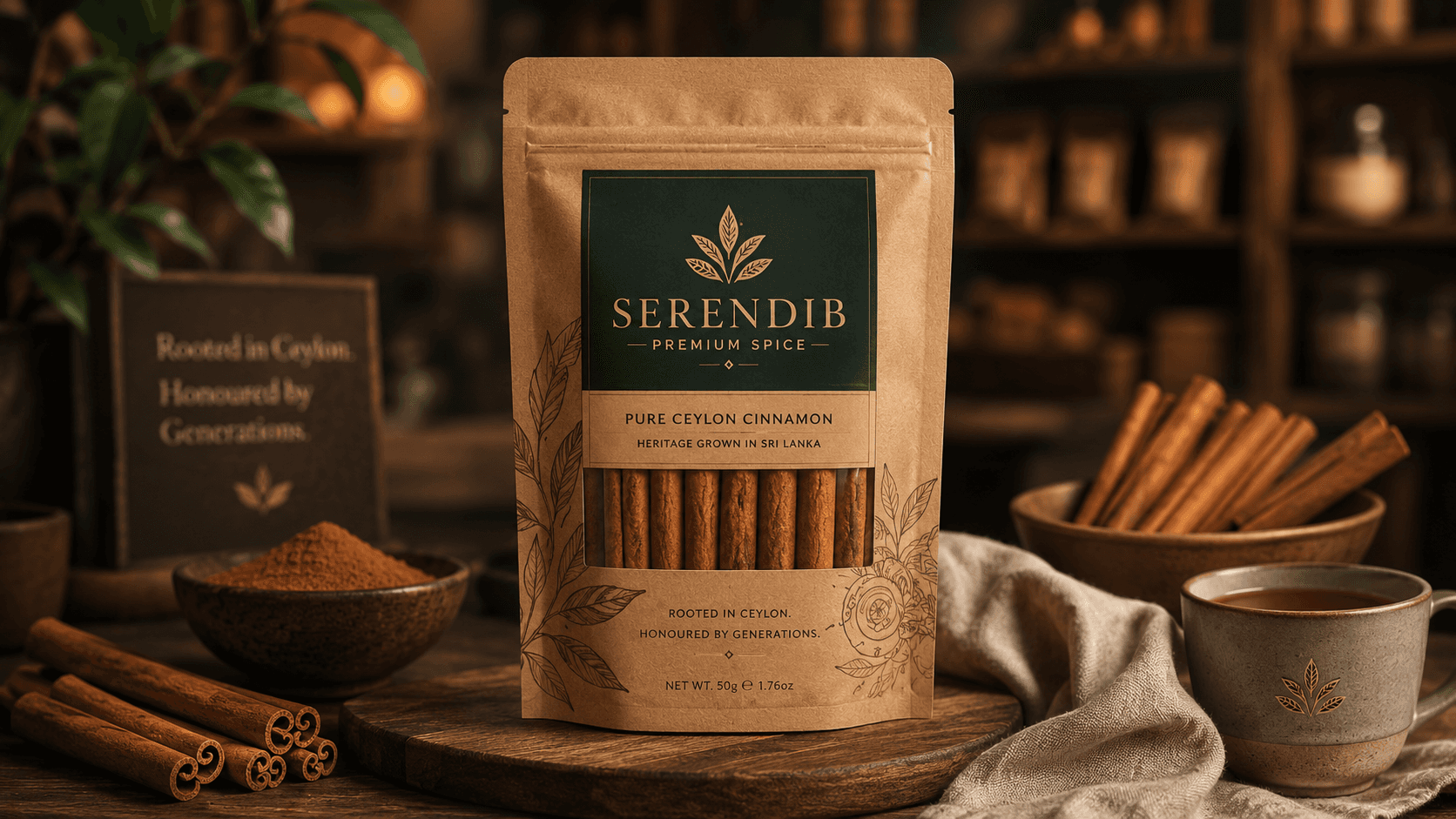
Serendib Spice
Branding & Visual Design

Serendib Premium Spice is a luxury spice identity concept born from Sri Lanka’s deep relationship with pure Ceylon cinnamon. The brand was created to feel rooted, ethical, and premium — not just another spice label on a shelf. My direction was to build a visual identity that honoured Sri Lankan heritage while presenting cinnamon as a refined lifestyle product.
Client:
Serendib Spice
Role:
Communication Designer
Year:
2026


Explore the full story –
Challenge
The challenge was to balance authenticity with luxury. Many spice brands lean heavily into rustic visuals, but I wanted Serendib to feel more elevated, editorial, and internationally marketable while still carrying its origin story. The brand needed to communicate organic quality, ethical sourcing, handcrafted, and cultural heritage without becoming visually overcrowded.
Objective
My objective was to create a clean, memorable identity system using the cinnamon leaf as the foundation of the logo. In the sketchbook process, I explored different leaf structures, spacing, proportions, and logo variations by hand before refining the mark into a minimal symbol with strong shelf impact. The final logo feels botanical, balanced, and timeless.
Results
The final brand board presents a cohesive premium identity across pouches, jars, tote bags, signage, menus, and campaign visuals. The warm palette — cinnamon, amber, terracotta, deep brown, sage, and parchment — was chosen to reflect spice, soil, craft, and natural purity. Playfair Display gives the brand elegance and heritage, while Lato adds clarity and modern balance. Together, the system positions Serendib as an authentic Sri Lankan cinnamon brand with a polished global presence.