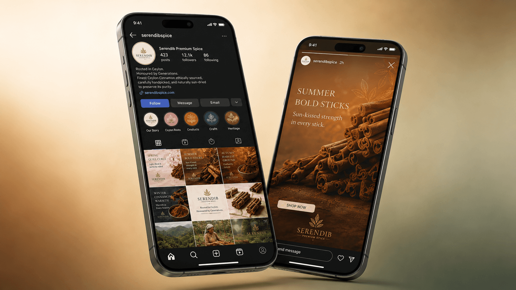
Serendib Premium Spice
A premium Sri Lankan spice identity brand built around Ceylon cinnamon, heritage, purity and modern shelf presence.
Client
Serendib Spice Co.
Scope
Brand Identity, Packaging, Campaign Visuals, Visual System
Duration
10 weeks
Year
2026

The problem
Serendib Premium Spice was created around Sri Lanka’s relationship with pure Ceylon cinnamon. The challenge was to avoid the usual rustic spice-brand language and instead build something more refined, editorial and internationally marketable.
The identity needed to communicate organic quality, ethical sourcing, handcrafted value and cultural heritage without becoming visually crowded.

The solution
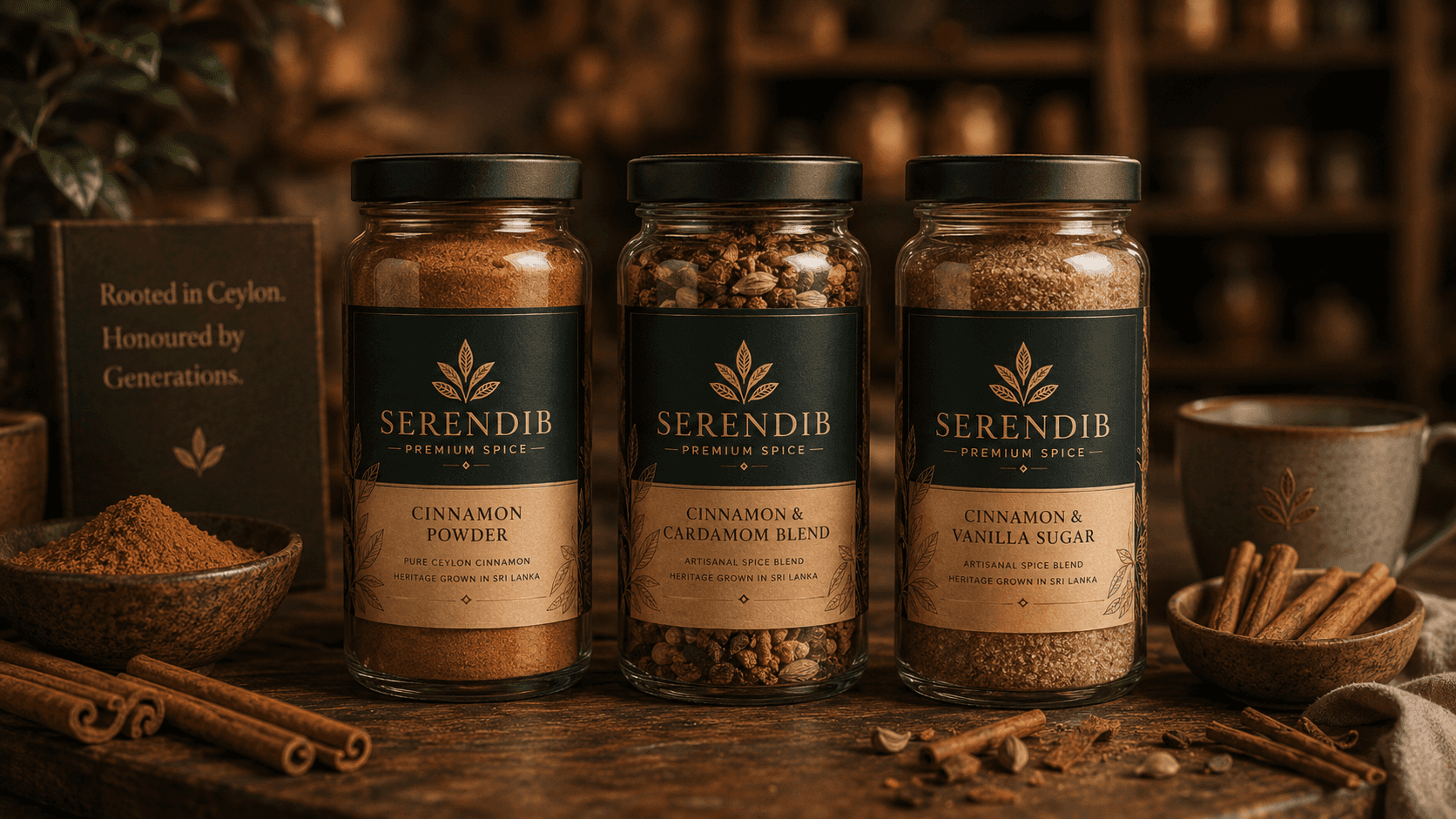
The visual direction centred on the cinnamon leaf as the logo's foundation. I explored leaf structures, proportions, spacing and mark variations before refining the identity into a simple botanical symbol with stronger shelf impact.
The wider system used a warm palette of cinnamon, amber, terracotta, deep brown, sage and parchment to reflect spice, soil, craft and natural purity. The typography pairing balanced elegance and clarity, helping the brand feel rooted but modern.